Marketing materials certainly help sell products and services. But interesting, creatively designed marketing materials can actually engage your audience, instil brand confidence and business credibility.
Whether you’re providing sales staff with support items like brochures, folders and sales sheets, or distributing them directly to prospects and clients, it’s vital that you’re promotional materials leave a compelling impression.
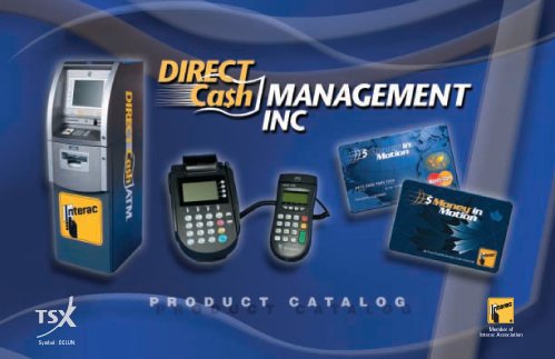
direct cash product manual
The client was looking for a product manual that would both establish their presence as the leader in their product offerings, but build on the brand. The ‘moving dollar’ part of the logo was used as a background graphic to offer a high-tech feel, reinforce the brand and generate interest.
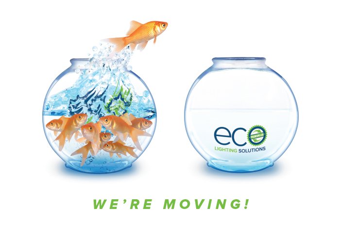
eco lighting solutions moving notice
With an old office that had become way too small and increasingly over-crowded, ECO was looking for something a little different to let clients know they were moving to a larger space. A couple of stock photos, some serious Photoshopping and ‘send’!
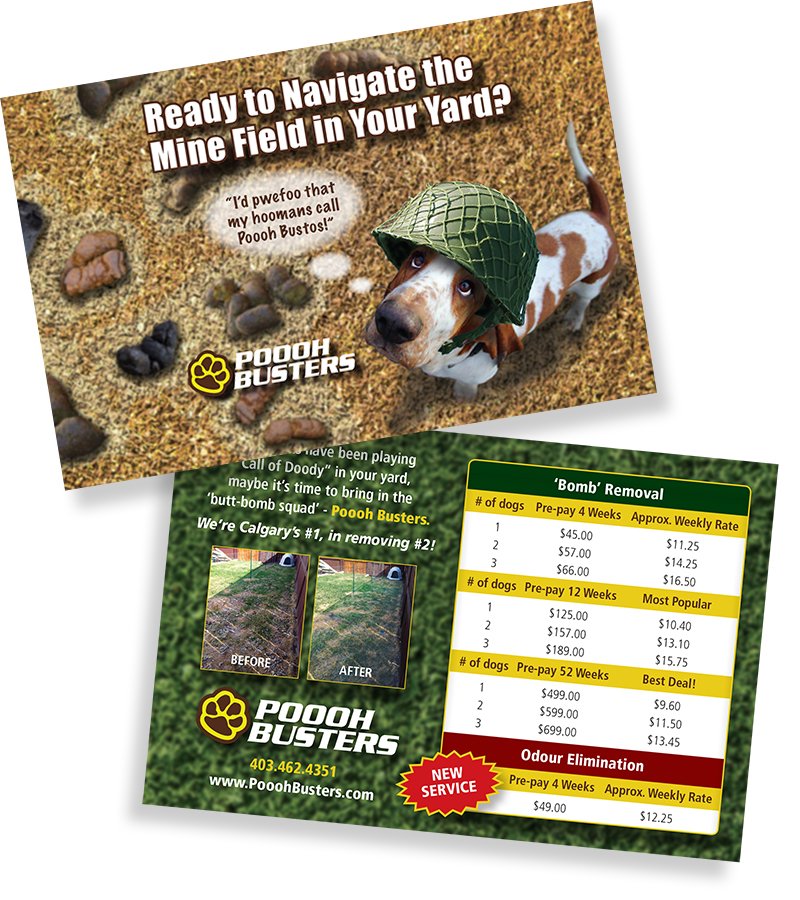
poooh busters tradeshow handout
Anyone willing to scoop poop for a living, clearly has a sense of humour. Such was the case with this promotional postcard for Poooh Busters. A client supplied ‘Before’ photo produced the idea for a minefield theme. A rather interesting angle on the photo of their dog, the sourcing of an army helmet to match the camera angle, several blurred shots of dog doo-doo, and some significant Photoshopping contributed to the well-received result.
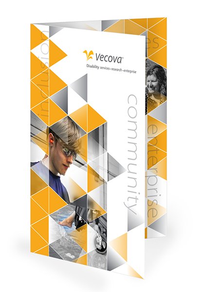
Vecova brochure
The client requirement for a series of brochures was to maintain brand consistency to the current materials in use. Three brochures with varying colours were designed that included the established geometric shapes with a calculated placement of colour and B&W images.
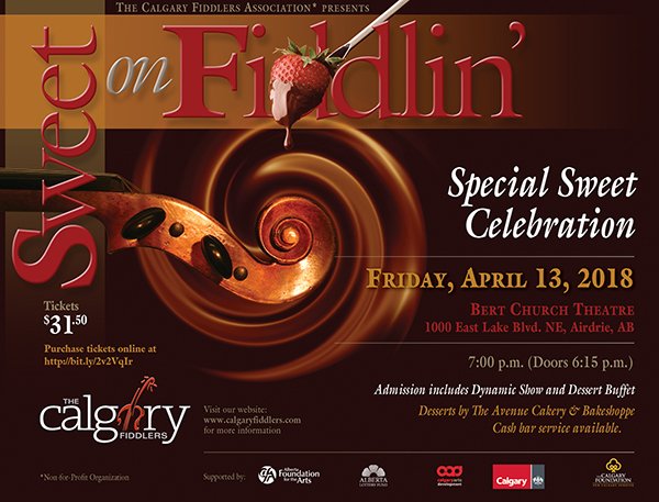
calgary fiddlers event poster
I was tasked with creating a poster to draw attention to a yearly event for The Calgary Fiddlers. Given the dessert angle for this ‘sweet’ event, a fiddle scroll image was combined with some chocolatey goodness and a little Photoshop ‘twirl’ to provide an interesting flow of images. Another example of creating a visual tie-in for two distinct themes.
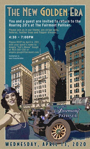
Fairmont palliser event poster
The Fairmont Palliser need a poster for a client appreciation event. With the roaring 20s as the theme, some period photos and other suitable images were sourced. From there a montage was created, then graphics and text added. The entire file was then exported to Photoshop where several effect filters were applied to create this ‘period’ poster.