Equally important as printed promotional materials, package design that grabs your audiences attention can have a positive affect on ‘wallets opening’.
Well designed packaging, product info and directions that are easily located and legible, as well as clearly placed information for size/colour/flavour, etc. can be a motivator for consumer choice, when audience ‘shelf time’ is limited.
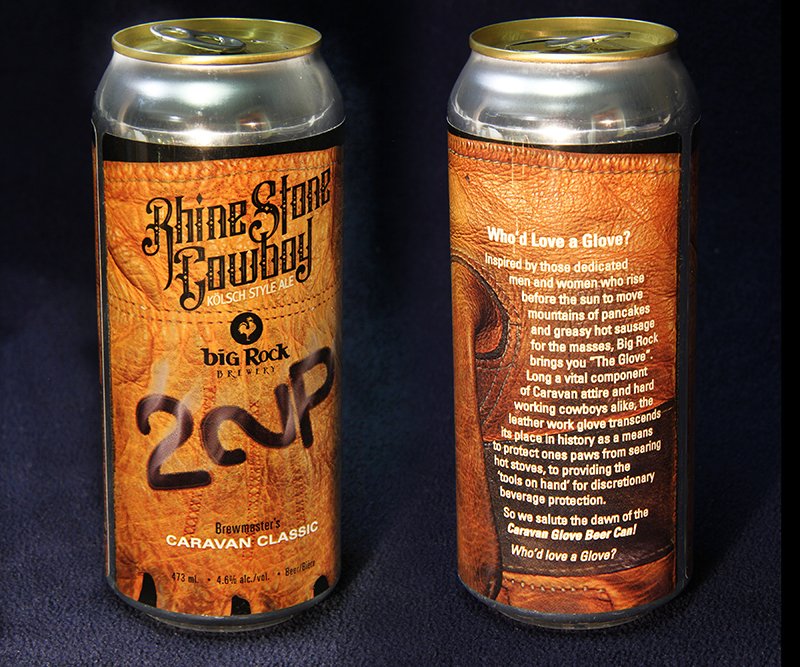
Stampede caravan committee branded beer label
With Big Rock as a sponsor, and Caravan as a major ‘investor’ (O.K. – consumer), the committee was bestowed a proprietary beer label. Given the tradition of wrapping the can in a work glove for a level of discretion during post event gatherings, it wasn’t hard to come up with a pertinent image to use as a basis for the design, and accompanying can verbiage to describe the said tradition. “Who’d Love a Glove?”
ThermoValet Boxes
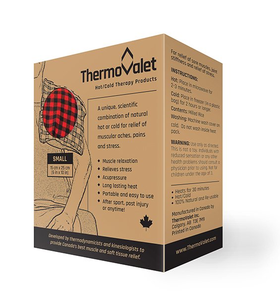
The client was launching an all-natural heating and cooling pad to help ease strained muscles and reduce inflammation.
The venture would need a visual edge to compete with other existing products so a logo was created that represented the heating and cooling features of the product.
The packaging mandate was to have a natural, organic appeal. It was decided black on light brown kraft stock would maintain this for the four box sizes. The various patterns and colours of the pads inside are indicated by a colour sticker that integrates directly into the illustration. Black only boxes with added full colour stickers helped save significantly on overall printing.
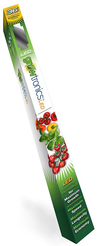
Growtronics light boxes
With a brand new logo in hand, the client wanted to further develop the brand with a proprietary line of LED grow-light boxes in 2, 3 and 4 foot sizes. Although the rather extreme dimensions posed creative challenges, the modular design and visuals provided sufficient versatility to meet the dimensions of each box size.
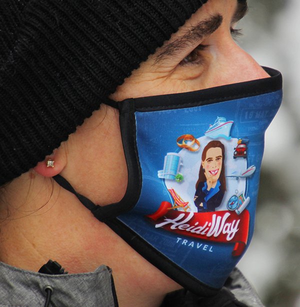
HeidiWay Face Mask
I figured as long as it contains or protects a product, and in this case it is the client, then it qualifies as an example of packaging. The logo I designed originally was placed off centre to eliminate any distortion that placement over the mouth or nose would have caused. Hopefully, samples like this will soon be only an entry in the history books.