VISUAL
IDENTITY
VISUAL
IDENTITY
Your logo is the focal point of your branding efforts.
A professional, well designed visual identity instills
a decided measure of credibility and complexity for your business, to both prospective and existing clients.
It not only represents your company’s corporate values and culture, it forms the backbone for all branding, marketing and advertising endeavours in both print and electronic form.
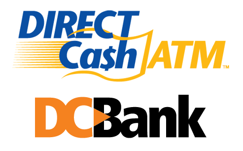
Directcash atm & dc bank
Tracing its roots all the way back to 1997 when Interac de-regulated, DirectCash ATM has grown to be the leading provider of ATMs, debit terminals, prepaid phone cards and prepaid cash cards in Canada, and around the world. The logo is a simple “money in motion” concept.
A spin-off of DirectCash ATM, DC Bank was initially conceived to boost consumer confidence in ATM use, by adopting the appearance of a “brand name” bank. As does the parent company, this logo also shows the transfer of money from one source to another.

Timbertown rebrand
Timbertown, an Alberta building supplies dealer required an updating of their original logo. A “rough hewn”, stylized font was created and placed within the reverse isosceles trapezoid shape of the original design, to maintain a recognizable visual transition during the re-branding process.
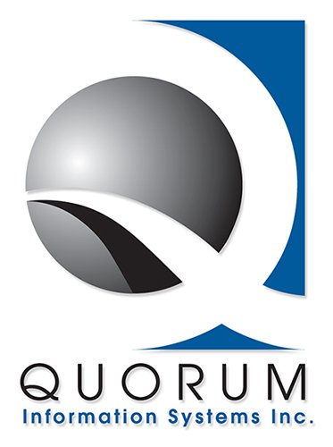
Quorum Information Systems
Quorum’s focus is on developing, marketing, implementing and supporting its state-of-the-art auto dealership and customer management system for full optimization. The logo features a stylized “Q” with an information highway graphic eminating from within a global nucleus.

Heidiway travel
The ultimate in the creation of a brand that’s specific and personal to the business owner. A photo was provided to use as a template to create a caricature of the owner, then stock art added to keep costs down which would have otherwise skyrocketed, and to display the diverse range of travel services covered.
Metropolitan school of bartending
This newly formed business needed a visual identity that would set them apart as unique, provide credibility and present itself as an established business. The logo integrates the educational aspect of a manual and the mixology component of the martini. I’d drink to that!

Fortress insurance company
With literally hundreds of companies across North America featuring ‘Fortress’ in their name, the challenge was to move beyond the graphic elements typical of an insurance company (shield, umbrella, armour, etc.) and come up with something fresh.
Knowing a castle graphic of some sort would need to be a focal point of the design, that overall shape was created using supporting hands to represent the ‘insurance’ aspect, with the fingers doubling as the merlons on the castle walls (yes, I had to look ‘merlon’ up!!)
The rebrand has provided Fortress with a more current, professional and credible image as they position themselves for future growth.
